A powerful, well-structured and creatively written service page can be transformative for a business. Read my guide on how to create a service page that converts.
Let’s face it; the ultimate purpose of a service page is to convert your all-important leads. Afterall, if you’re pouring your time, energy, resources and money into building a website for your business, you want to make sure that you get a return on your investment, right?
How do you create a service page that converts? Your service page should speak straight to your audience’s pain points, providing a solution that features your unique value proposition, an intuitive page flow, social proof and a powerful call to action.
Which sounds great – but what does it look like in reality? I’ve created a step-by-step guide taking you through my tried and tested method for building out a service page that converts, including real-life examples of bulletproof service pages.
What is a service page?
Before we really get our hands dirty, let’s take things back to basics: what is a service page?
A service page does what it says on the tin; it is a page on your website which describes what you as a company do, why you are so in-cred-ible at it and why people would want to work with you. It may lay out your packages and/or costs, as well as different areas that you cover.
A service page is not the same as a product page. A product page is a page on an eCommerce website that shows customers the different items that they can buy; these often include specifications and features, product reviews and will kickstart the buying process.
Step one – run a customer needs analysis.
Before you start thinking about your service page structure or the copy that you want it to feature, you need to run a customer needs analysis. Why? Because if you don’t know who you’re talking to and what they require, then you may as well throw your service page off the top of the Empire State Building.
I like to break this down into four core areas to help pinpoint the best way to layout the service page.
What stage of awareness are they at?
Do they have an understanding of what you do and why it is necessary? For example, if you are targeting start-up businesses or those who are moving their side-hustle into a full time career, then they may not know as much about your industry and how you could benefit them as someone who is more established in the business world. In this case, you may choose to include FAQs on your service page, or copy that is more accessible and explanatory.
What are their pain points?
This will drive SO much of your service page – you need to understand and respond to your audience’s pain points. I like to include an entire section on purely pain points; something that is positioned in a way that is eye-catching and compelling, encouraging them to read further on down the page.
What are their anxieties?
Are they nervous about investing? Do they want to know potential costs before getting on a call with you? Do they shy away from technology, and therefore seek an easy, user-friendly contact system with you? Have a think about any of the anxieties that may stop your customers from getting in touch, and then factor them into your website layout and design.
What outcomes are they hoping for?
Your service page shouldn’t be all doom and gloom – far from it. It should be uplifting and clearly show them the place they can get to if they work with you. By understanding the outcomes that your customers hope for, you can make sure they are strategically woven into your service page.
Step two – perfect your mission statement for your hero message.
A hero message (sometimes called hero text and hero banner) is the large line of text that appears at the top of a website page. It will often be layered over an image or will have a block background. Hero messages generally include:
An attention grabbing headline
A short extension summary
A call to action
Don’t forget – this is the first thing your reader is going to see on your service page. So make it snappy. It should intrigue and excite them. If you don’t grab their attention in seven seconds, there’s a high chance they’re going to close that tab.
Here are a few examples of hero banners that I think nail it.
Why it works:
It’s clear, to the point and concise – it tells the reader straight away what they are going to get
It features the brand colours for Littlebigbox
The image in the background doesn’t take too much attention; it enhances the energy of the text
Website: https://www.innovateandthrive.co/
Why it works:
It shows personality – it’s memorable and engaging
The action is clear: WORK WITH ME
It’s designed in a visually pleasing way
Step three – consider your unique value proposition.
A unique value proposition is a statement that outlines how potential customers will benefit from your service, how this service will address their needs and deliver a solution and what makes your offer different from everyone else. I know – quite a meaty task!
This is super important when it comes to your service page structure. Your UVP should be immediately prominent on your page – it needs to be unmissable. This is the information that your customers need. Without it, you’re giving them no reason to work with you.
There are different ways that you can display your unique value proposition, including:
Setting it out as PROBLEMS and SOLUTIONS (picture ‘Does this sound like you?’ VS ‘Imagine if you could…’
The flow of your website is paramount if you want to keep eyeballs on your page (and to convert those eyeballs into genuine leads).
Once you have a clear idea of who your audience is and what they need from you, you can formulate a service page flow that takes them on a journey. This journey can differ enormously, but as a general rule this one works well for me:
Capture their attention
Relate to them on a personal and professional level
Give them a glimpse of their future
Bring them back down to reality by showing them how you can help
Reassure them that you are the real deal with social proof and testimonials
Answer any burning questions or concerns
Leave them with a unquestionable call to action
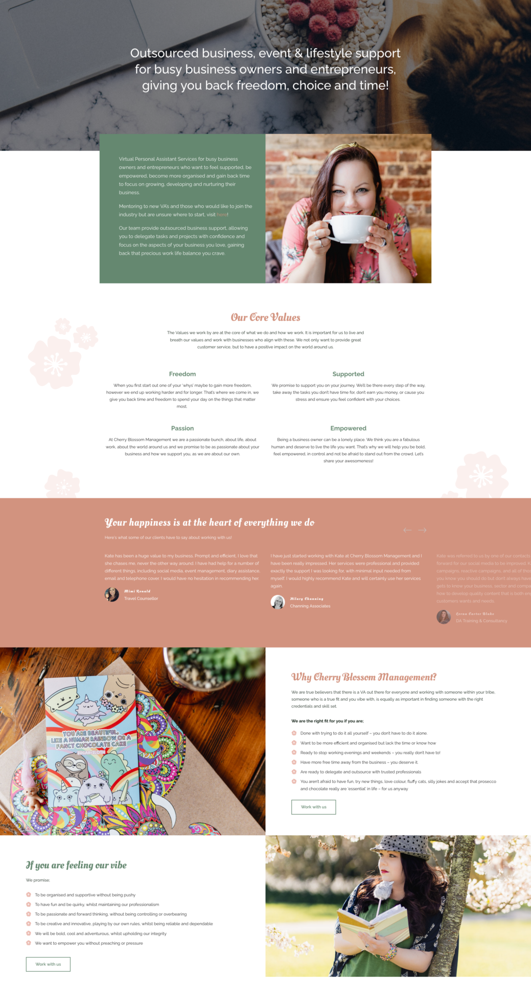
Of course, the way you interpret this will change depending on your industry and audience. Below is an example of a service page I worked on with Kate from Cherry Blossom Management where I’ve highlighted the different stages of the journey.
Website: https://cherryblossommanagement.co.uk/
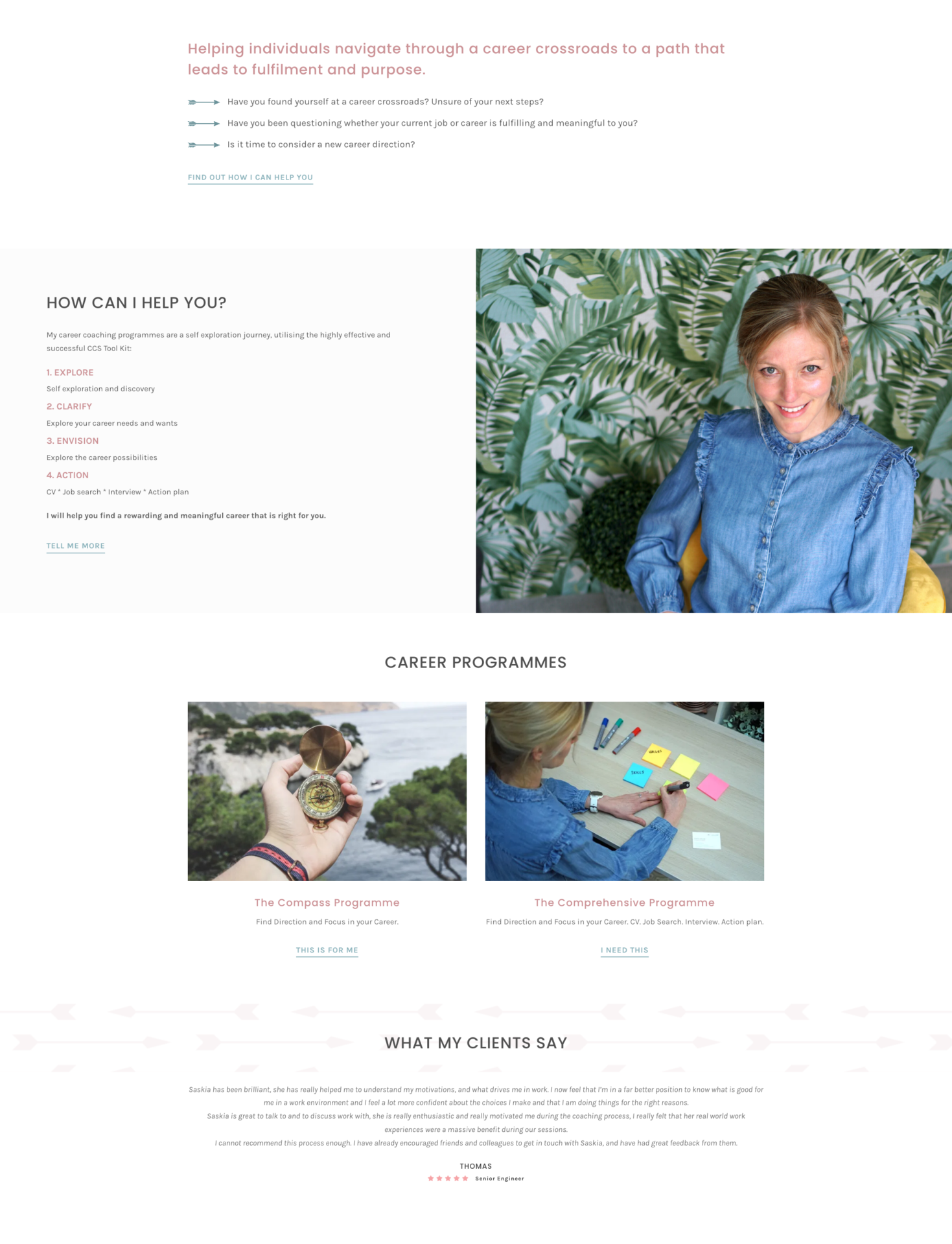
I also worked with Career in Focus, and have shared below the way we chose to structure their service page.
Website: https://career-in-focus.co.uk/
Step five – social proof.
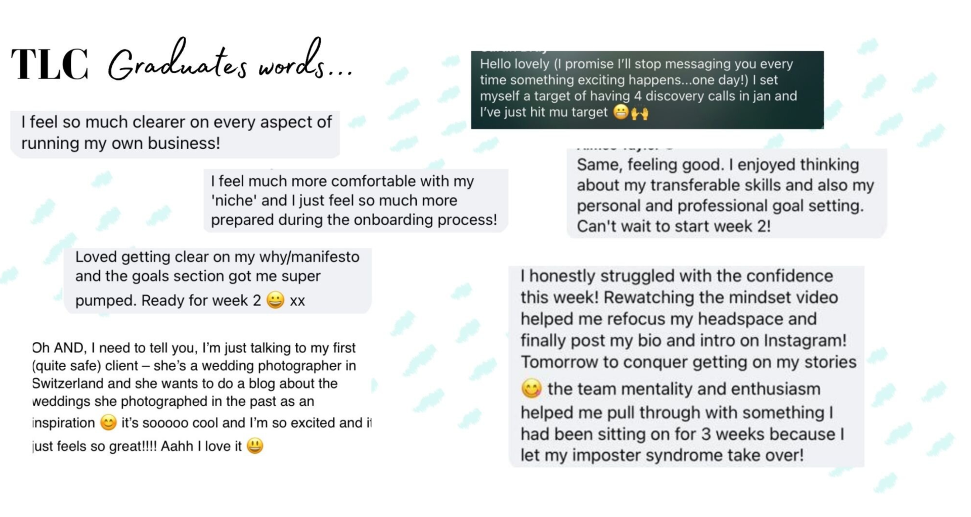
I’ve already mentioned social proof, but it needs repeating. If you want your service page to convert, then you need to show your audience that they don’t have to just take your word for it.
Use testimonials that are relevant to this particular service. For example, if you’re a Brand Designer who also runs coaching programmes, your audience isn’t going to want to read from your coaching clients when they’re looking to hire you for a full brand design.
Consider how you want these testimonials to be displayed – you don’t have to stick with standard text. You can include images, videos, sliders… Go wild!
Below are a few different ways that you could display social proof and testimonials on your service page:
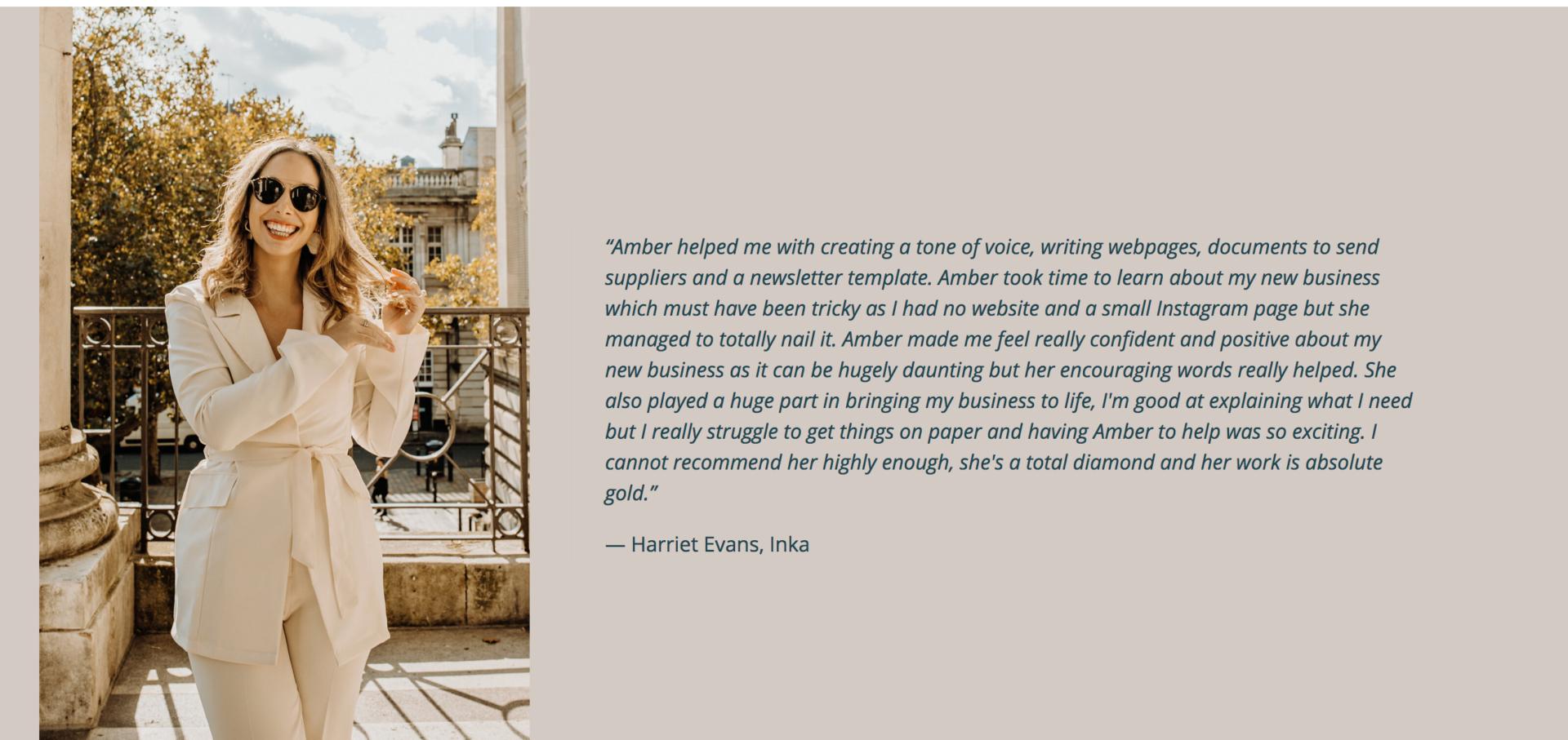
As a stand-out section of the page including an image of the client:
Website: https://www.thewildwordsmith.co.uk/
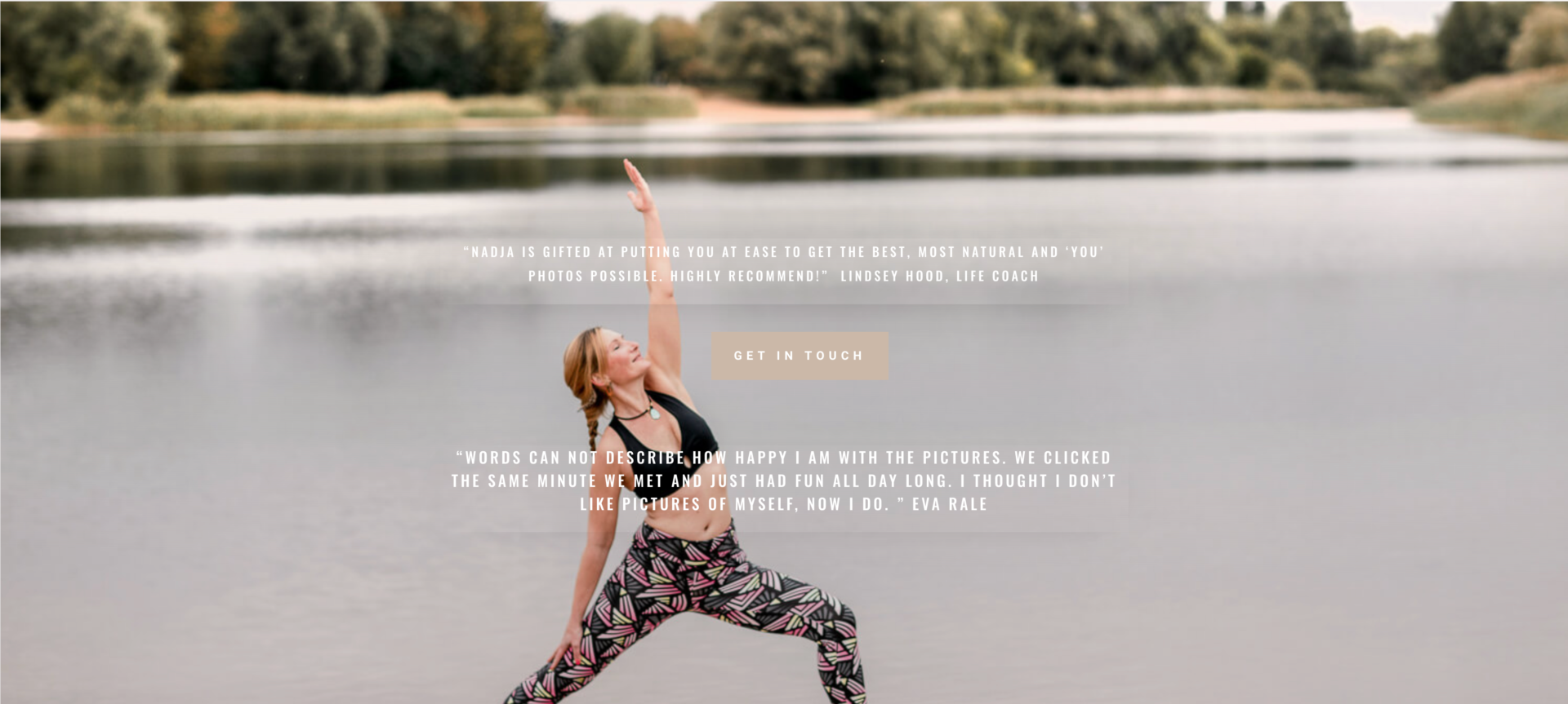
With more than one testimonial (shown on a slider, over an image or in boxes etc):
Website: https://nadjalitau-photography.com/
Screenshots of social media comments and conversations:
Your call to action is that final step – it’s the action that you want the reader to take once they have finished absorbing your content. It’s therefore important that you don’t hide it away!
Your call to action needs to be unmissable. You should also include it several times across your site. Sure, you don’t want to hound the reader (and too many uses of your call to action can be off putting) but you do want to reinforce your message. When repeating your call to action, experiment with wording it in different ways. You can then look into your analytics and find out which one is performing the best and tweak the others accordingly.
Here are some call to action buttons that I think really command attention:
Website: https://cherryblossommanagement.co.uk/
Step seven – add a conversion funnel.
Now, this one is a WHOLE different subject for a TOTALLY new blog! But, I want to mention it as it’s an important point to keep in mind. You cannot expect your service page to do all of the hard work for you. If you are directing your leads to a newsletter, or a booking form, or a diary scheduler, then you need to have a strategic system waiting for them on the other side.
This could be as simple as a thank you message, or you could go as far as creating an email sequence for them. Either way, don’t forget that you need to nurture your leads at all stages of the process; both on and off your website.
Can Littlebigbox help me create a service page that converts?
You bet – this is what we do!
If you’re looking to improve your online presence, increase your leads and maximise your conversions, then get in touch to book a free consultation over a cuppa. I’ll talk you through the different ways you can work with us, what I think would be the best option for your business and marketing goals and how the Littlebigbox process works.
August often brings a bit more breathing space. The inbox quietens down, a few clients are away, and there’s usually a natural pause before September picks up again. It’s a…
If you’ve been looking at your website recently and wondering whether it’s time to start again, you’re certainly not alone. It’s a question I hear regularly from business owners. Sometimes…
First impressions matter more than you think When someone lands on your website, a lot happens in just a few seconds. Understanding what happens when someone visits a website can…