
Why Videos Help eCommerce
Wondering why videos help eCommerce? This blog post is going to breakdown exactly why video is such a useful tool for eCommerce. Firstly showing some statistics to backup it’s effect.…

Responsive web design (RWD) is an approach to web design aimed at developing sites to provide an optimal viewing and interactive experience, it is easy reading and has navigation with a minimum of resizing, panning, and scrolling—across a wide range of devices (from desktop computer monitors to mobile phones).
Responsive website design has become a very important part of all websites over the last couple of years and we highly recommend that your website is fully responsive.
Below is an example of what a responsive website design can look like, as you can see the website design has adjusted to accommodate the screen size and device it is being viewed from.
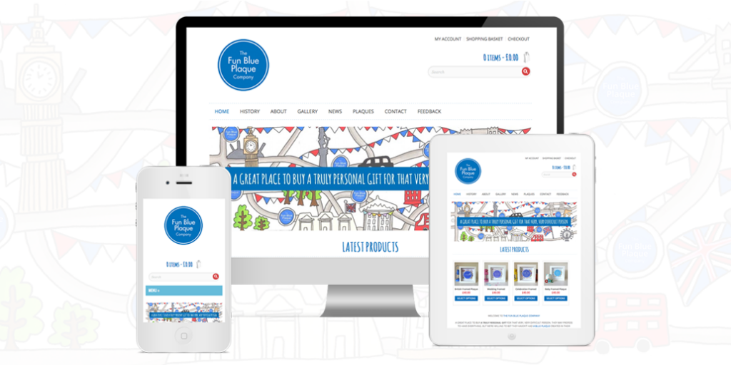
Most users will be viewing your website from a tablet or mobile device and if it’s fully responsive they will be able to view your website with no issues at all. However, if your website isn’t responsive most people viewing your website from a tablet or mobile device will probably leave after viewing the first page this is because it becomes to time consuming to have to scroll in and out of the pages to try and click on links, pages and read content.
You may also find that your enquiries or website views increase due to having a fully responsive website.

The fastest way to test if your website is using responsive design is to open your site using a browser like Chrome, Firefox or Safari and taking your mouse to the bottom right corner of the browser window and dragging it from the bottom right to left.
As you do this you should see your website adjust to the new screen size you are changing to as you make the browser window smaller.
To the right is an example of testing responsive design.
You will see an arrow on the image which shows where you place your cursor to move your browser screen in and out to test the responsive level of your website.
If you need any help with making your website responsive please feel free to get in touch and we will advise you what will be best for you and your website.


© Littlebigbox Limited is a company registered in England (Company No. 13663893) Romsey, SO51 6BY. (VAT No. GB448056874). All Rights Reserved · Privacy Policy