Some of my favourite projects start with a familiar face. Liz first worked with me back in 2018, on a new website for the company she was with at the time. When she moved to rFpro and they needed a fresh website too, she got in touch again. That still means a lot to me.
rFpro is a driving simulation company working across the automotive and motorsport world. They already had a website, and plenty of work had gone into it over the years. It just wasn’t doing what they needed it to.
Where things were
The website had grown into something quite overwhelming. There was a lot of content to work through, and it was hard to find your way around. For someone landing there for the first time, it was tricky to know where to start.
Some SEO was in place, but it was limited, so traffic wasn’t where it needed to be. rFpro wanted more of the right people finding them, and more of those visitors turning into sales.
It’s a really common story. A website gets added to bit by bit over the years, until it starts working against the business rather than for it.
What rFpro needed from their new website
They were looking for a full website overhaul. The new site needed to work beautifully on every screen, with video built in to show their products in action. They also wanted dedicated landing pages, a language translator for their international visitors, and a proper SEO strategy behind it all.
The biggest challenge was simplifying everything without any product getting lost along the way. rFpro has a lot of brilliant products, and each one deserved the same attention.
How I approached the redesign
I built the whole website around what the visitor actually wants to see. That meant starting with the navigation and making it much easier to find your way around.
From there, I reorganised the content so it flowed in a more logical order, and updated the design so everything was easier to take in. Each page now has more breathing room and far less to wade through.
The site also had a full SEO audit and a strategy put in place across every page, so the new website had solid foundations for being found online.
The result
The new rFpro website is clear and intuitive to use, with a strong design that catches the eye. Their whole product range has room to shine, without visitors feeling bombarded.
“I first worked with April in early 2018 to create a new company website and was delighted with how the project went from start to finish. When I moved to a new company, which also needed a fresh website, April was my first port of call. She’s a great listener, taking time to understand the business and website goals, who then works with you to translate that need into a creative, impactful digital solution.”
Liz Howland, Marketing at rFpro
Is your website starting to feel a bit much?
If your website has grown over the years and now feels hard to navigate, you’re definitely not alone. Sometimes a full overhaul is the answer, like it was for rFpro. Other times a good tidy up is all it needs.
I’m always happy to talk it through over a call and help you work out which route makes sense for you. Book a call
Sarah Partington already had a successful interior design business here in Hampshire. But for a long time, she’d had a dream of sharing her years of experience with people who…
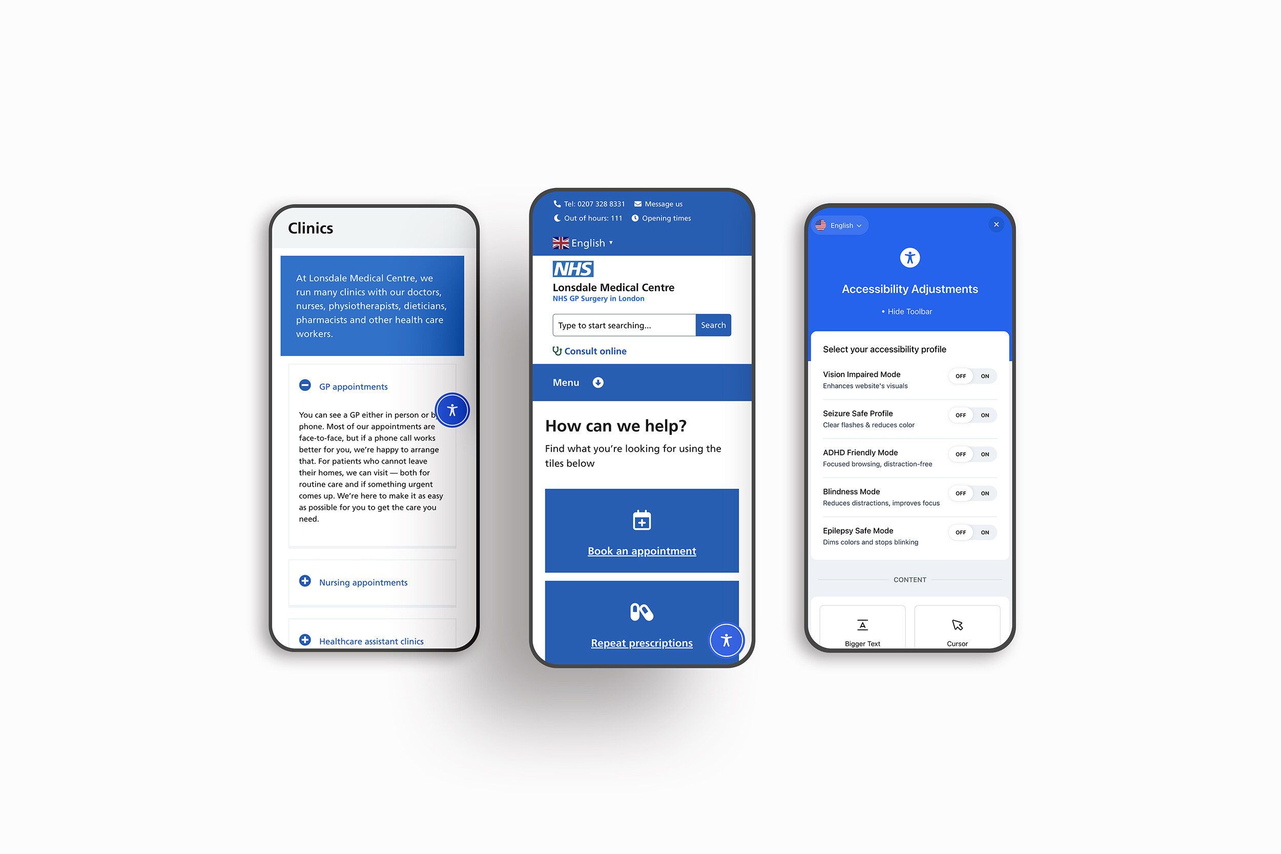
When Lonsdale Medical Centre, an NHS GP practice based in North London, reached out to us, they needed a website that met strict NHS digital standards while remaining clear, welcoming…
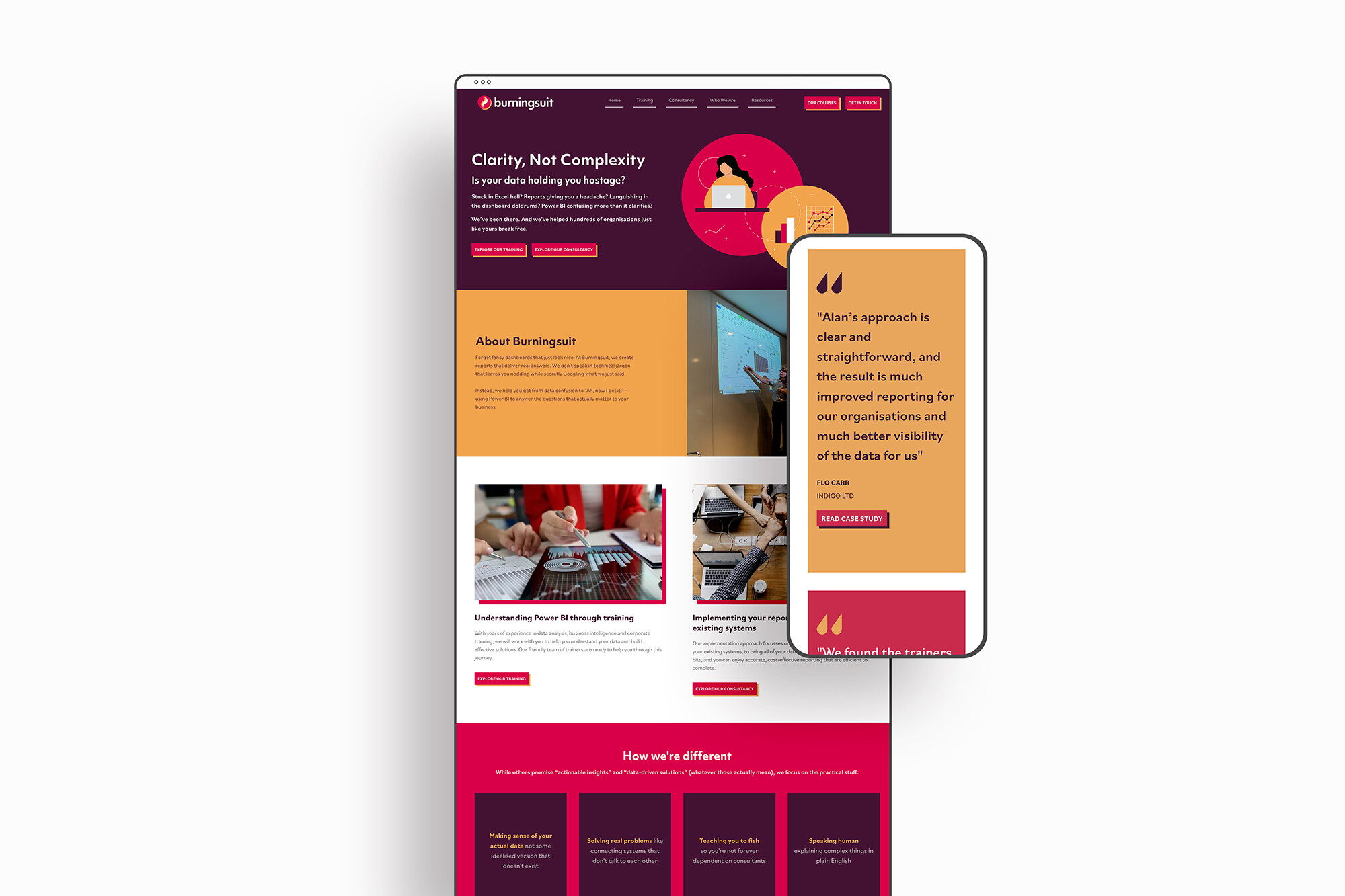
We’re excited to share a recent project we worked on for the team at Burningsuit – a leading provider of Power BI, Excel and DAX training courses. They came to…