Website feeling a little down in the dumps? Read on for our top tips on how to zhuzh up your website.
Spring has officially sprung (although, if someone could tell that to the weather we would all be very happy) and with it comes a great opportunity to spring clean your business. First stop? Your website.
Honest answers only please; when’s the last time that you spruced up your website? Not necessarily a total website overhaul, but a bit of TLC?
Small tweaks and changes can take a backseat when you’ve got major tasks on your business to do list – even though it’s these subtle shifts that can make the biggest difference. Website design can increase time on a site by 84% and yearly online revenue by 132%. Those figures are nothing to be sniffed at; in fact, they should be acted on pronto.
‘Cos your website is your 24-7 sales team. It’s the face of your business and your way to showcase your brand, service and/or products to your dream audience (with a hefty sprinkle of personality to boot). So, how can you ensure it’s helping you shine in the best way possible?
Check out these six snappy ways to zhuzh up your website this spring.
RELATED: 5 SIGNS YOUR SMALL BUSINESS IS READY FOR A WEBSITE UPDATE.
AND
WHAT’S IT LIKE TO WORK WITH A BOUTIQUE WEBSITE DESIGN AGENCY?
1. Show off your playful side.
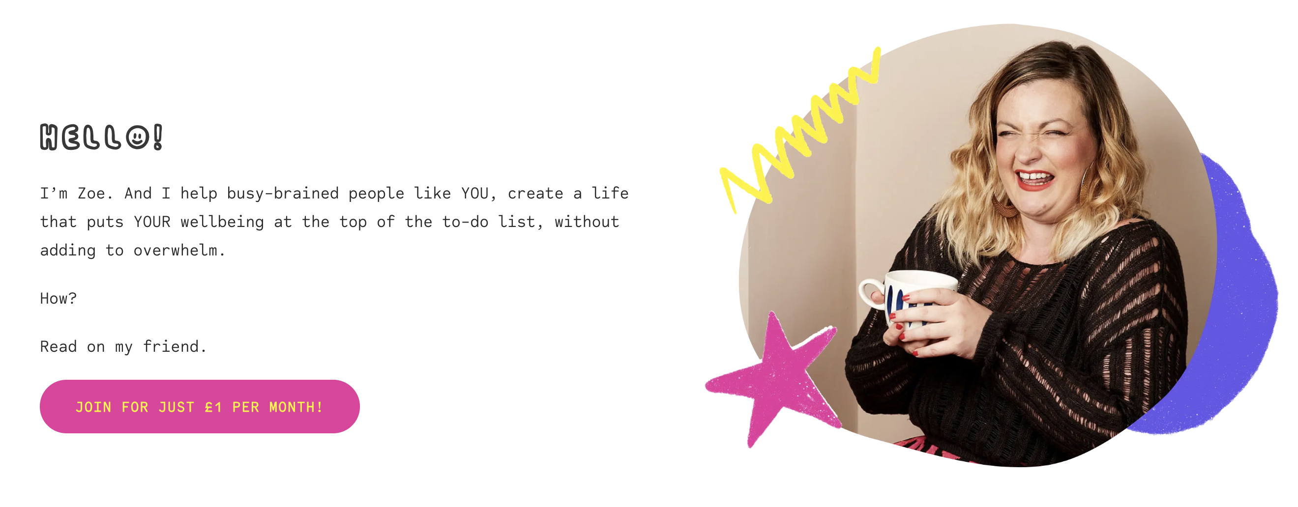
We all know how important it is to feature images of yourself – the business owner and/or team – on your website. Research has shown that websites which include images of human faces bring with them far higher conversion rates – 102.5% to be exact in one particular study. Something that we have seen to be super successful is when businesses add in images that sit on the quirkier side of the fence.
People connect with people. And while there is absolutely a place for more ‘serious’ images in your brand photography, it’s also great to drop in a few shots that show your personality. If you’re a person who loves a good laugh, then show it! If you love your pets, include them in your pictures! Better yet, include some design elements that emphasise your brand around these images to add even more vibrancy. This was an important part of our design brief with Zoe from Wellgood Wellbeing – we think you’ll agree that her images add so much to the overall vibe of her website.
2. Add a short intro video of yourself.
Now, we know that this can bring people out in the heebie jeebies. Record an entire video of yourself?! Are we being serious?!
According to Unbounce, having an intro video on your website landing page can rev up your conversion rate by 80%; the reality is that video marketing works. Add on the fact that well constructed and optimised videos can also increase SEO, engagement and user experience tenfold… It’s a dream scenario.
Our client, Luci (of Luci Morgan Estates Agency), utilised video for her FAQs. The video – which is just under a minute and a half long – features Luci talking to the camera with text overlay for her company’s most commonly asked questions and her branding threaded throughout. It’s informative, engaging and snappy.
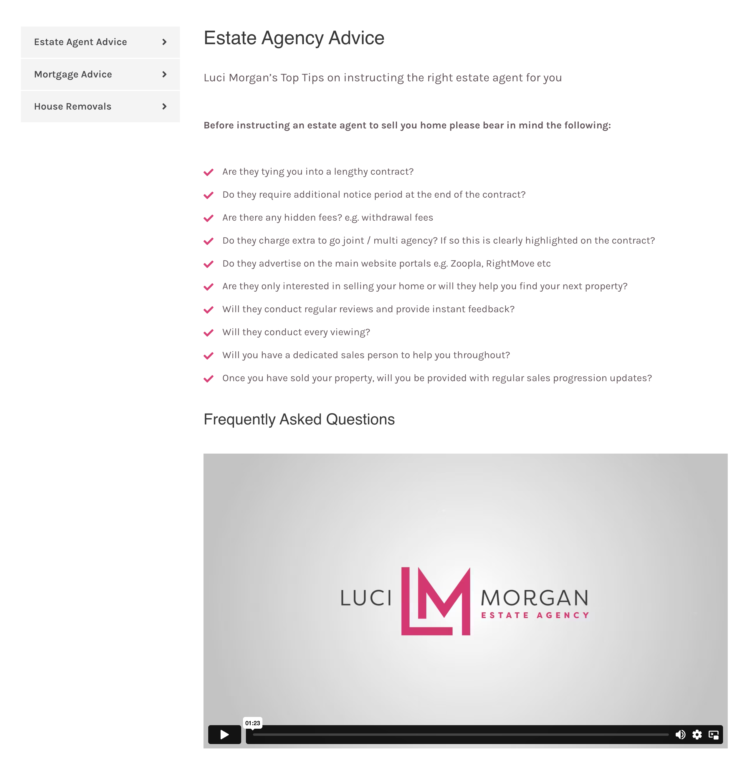
If you’re not currently in a position to invest in a videographer, there are plenty of ways you can make a simple self recorded video feel more professional. Canva offers excellent video intro templates and there are endless online guides walking you through the steps necessary to create something valuable and informative for your audience.
READ MORE: WHY VIDEOS HELP ECOMMERCE.
3. Make it move.
Wellgood Wellbeing’s website is the perfect example of a ‘site that leaps off of the screen.
Does your website feel a bit… Well, stationary? It could be time to think about motion graphics.
Motion graphics refer to animation – often with a text element. They bring movement and energy into a website, boosting the energy of your site and making it all feel hell of a lot more interesting. Ways that you can drip feed motion graphics into your website include:
- Kinetic typography
- Hover effect
- Animated logos
- Parallax effect
- Animated illustrations
- GIFs
- Morphing
- 3D animations
As well as being visually appealing, motion graphics can bring ease into the user-experience. How? Moving visuals can nudge your audience in the right direction and provide live feedback about their actions. Just make sure you don’t pack your site with them. Animated graphics will slow down loading speed: one of the critical factors contributing to bounce rates. In fact, research suggests that 53% of potential will leave your website if it takes longer than three seconds to load. Find that sweet spot and reap the rewards.
4. Explore alternative ways to showcase your brand.
Most brands will have primary and secondary options; from your logos to your typography to your colour palettes. One simple way to experiment with a website refresh is by mixing up the elements of your brand that you’re featuring.
We had a lot of fun working with Kate from Cherry Blossom Management’s brand when we rebuilt her website. Her colour palette is bursting with bright colours and she also wanted to utilise different emojis throughout the content that she felt captured her brand. This meant we had a great opportunity to layer in lots of vibrancy and energy to her website, all driven by her bold brand.
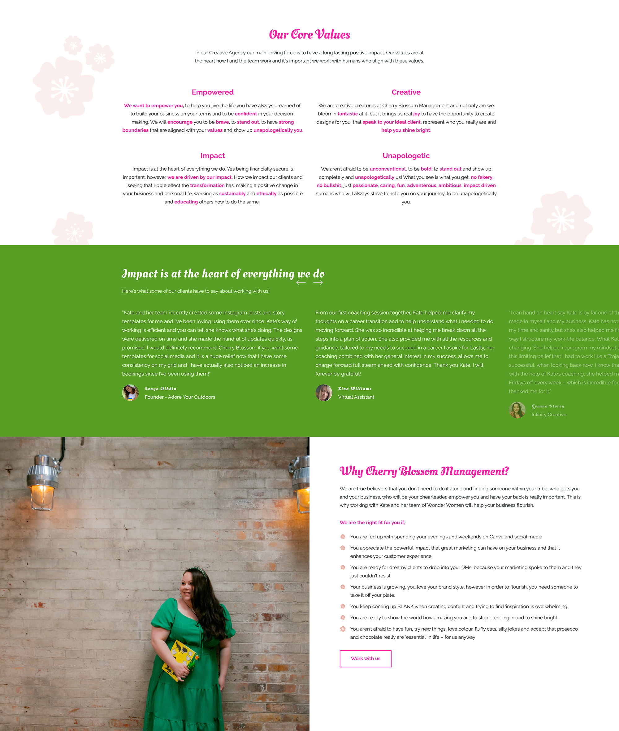
Of course, a branding expert will be able to guide you through this with precision, but even utilising different brand elements can be a brilliant tool for giving your website a new lease of life. Or, if you’re lucky enough to have super detailed brand guidelines, perhaps explore the use of more seasonal colours from your palette as with hop into spring?
5. Add a pop of fun with your buttons and CTAs.
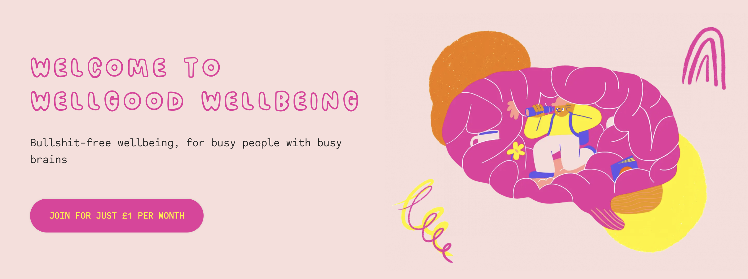
We often talk about the importance of your calls to action (CTA) and website buttons. Afterall, they’re the bridge between where your potential customers are and where you want them to go.
We’re going to be frank with you; we see many CTAs that are dull as dishwater. Phrases that we’ve heard a million times before in a design that’s far too easy to scroll past. This is your opportunity to do things differently.
Rather than SIGN UP HERE why not say GIMME! GIMME! GIMME!
Instead of CONTACT US try LET’S HAVE A BREW.
Forget BUY NOW and become better acquainted with I CAN’T LIVE IF LIVING IS WITHOUT YOU (okay we maaaay be getting carried away).
Again, it comes back to finding that sweet spot – the fine balance between sharing a message that captures your originality and ensuring you aren’t making things too abstract for your audience. In addition, ask yourself this: what’s one thing that I could do to make the design pop even the tiniest bit more for this CTA?
6. Mix up the layout (using genuine proof).
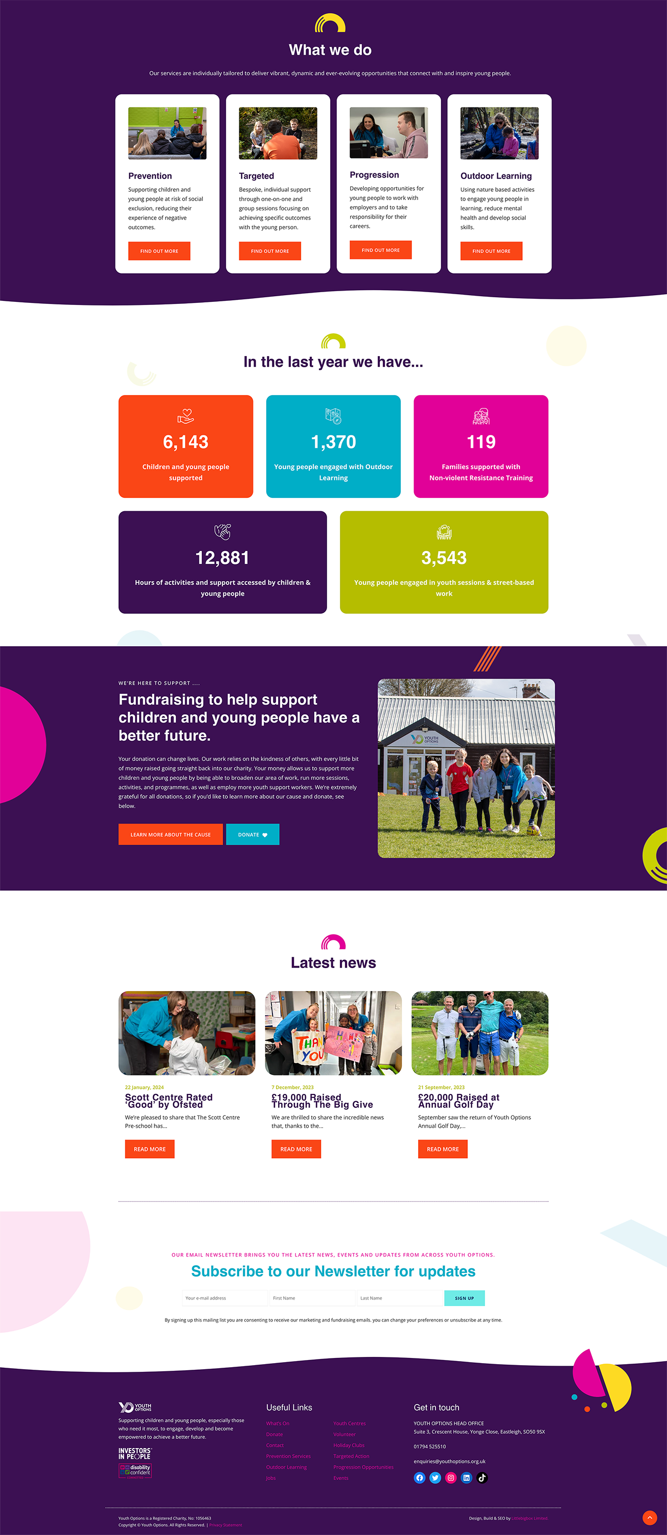
Take some time to really look at the current layout of your website and what’s working for you… and what isn’t.
The last thing that you want is for your website to look old and outdated. Page after page of left aligned text, minimal images and clunky navigation simply doesn’t work. How can you keep the eye moving from section to section, maintaining an individual’s attention and building up intrigue as their journey across your site progresses?
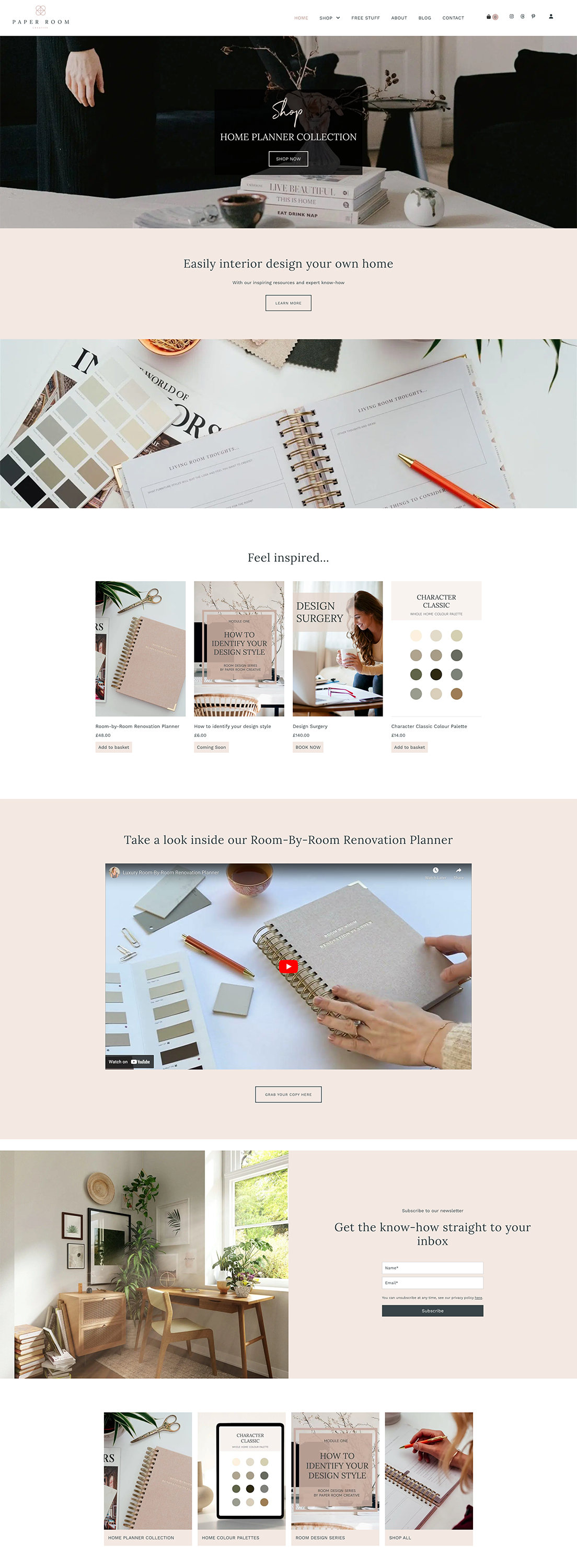
We loved working on this clean and sophisticated layout of Paper Room Creative’s website.
Start off by looking at the bounce rates on each page. Which one is the most popular? Which one is the least popular? Why might that be? Act on it.
Next, consider how busy each page feels. Can you add more space? Can you alter the sections so that the more ‘text heavy’ sections aren’t all lumped together?
Finally, don’t be afraid to gain inspiration from businesses who are smashing their website game out of the park. What feels so attractive about them? Is there any way that you could apply those principles to your own brand and website?
And if you REALLY aren’t sure where to start? Well, that’s where your fabulous and friendly web designer is worth their weight in gold 😉
How can Littlebigbox help me spruce up my website?
Here at Littlebigbox, we have a selection of services to help you put your website (and business!) in the spotlight.
Whether you need a full website design, a website audit or a sprinkle of SEO magic, our small but mighty team is here to help. Have a wander through our website and, when you’re ready, head over to book a virtual brew in with a member of the LBB crew. We can’t wait to chat!
CRAVING MORE TIPS? READ 6 WEBSITE TRENDS TO LOOK OUT FOR IN 2024.


